Finding underground gas leaks is now as easy as finding a McDonalds, thanks to a combination of Google Street View cars, mobile methane detectors, some major computing power and a lot of ingenuity.
When a city’s underground gas lines leak, they waste fuel and release invisible plumes of methane, a potent greenhouse gas. To find and measure leaks, Colorado State University biologist Joe von Fischer decided to create "methane maps," to make it easier for utilities to identify the biggest leaks, and repair them.
“That’s where you get the greatest bang for the buck," he pointed out, "the greatest pollution reductions per repair.”
Knowing that Google Maps start with Google Street View cars recording everything they drive by, along with their GPS locations, von Fischer’s team thought they would just add methane detectors to a Street View car. It turned out, it was not that simple.
"Squirrelly objects"
The world’s best methane detectors are accurate in an area the size of a teacup, but methane leaks can be wider than a street. Also, no one had ever measured the size of a methane leak from a moving car.
"If you’ve ever seen a plume of smoke, it’s sort of a lumpy, irregular object," von Fischer said. "Methane plumes as they come out of the ground are the same, they’re lumpy squirrelly objects.”
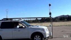
The team had to develop a way to capture data about those plumes, one that would be accurate in the real world. They set up a test site in an abandoned airfield near campus, and brought in what looked like a large scuba tank filled with methane and some air hoses. Then they released carefully measured methane through the hose as von Fischer drove a specially equipped SUV past it, again and again.
They compared readings from the methane detectors in the SUV to readings from the tank.
“We spend a lot of time driving through the plumes to sort of calibrate the way that those cars see methane plumes that form as methane’s being emitted from the ground,” von Fischer explained.
With that understanding, the methane detectors hit the road.
Turning data into maps
But the results created pages of data, "more than 30 million points,” said CSU computer scientist Johnson Kathkikiaran. He knew that all those data points alone would never help people find the biggest leaks on any map. So he and his advisor, Sanmi Peracara, turned the data into pictures using tools from Google.
Their visual summaries made it easy for utility experts to analyze the methane maps, but von Fischer wanted anyone to be able to identify the worst leaks. His teammates at the Environmental Defense Fund met that challenge by incorporating the data into their online maps. Yellow dots indicate a small methane leak. Orange is a medium-size one. Red means a big leak - as much pollution as one car driving 14,000 kilometers in a single day.
Von Fischer says that if a city focuses on these biggest leaks, repairing just 8 percent of them can reduce methane pollution by a third.
“That becomes a win-win type scenario," he said, "because we’re not asking polluters to fix everything, but we’re looking for a reduction in overall emissions, and I think we can achieve that in a more cost effective way.”
After analyzing a methane map for the state of New Jersey, for example, the utility PSE&G has prioritized fixing its leakiest pipes there first, to speed the reduction of their overall pollution.
“To me that was a real victory, to be able to help the utility find which parts were leakiest, and to make a cost effective reduction in their overall emissions," von Fishcher said.
Von Fischer envisions even more innovation ahead for mapping many kinds of pollution… to clean the air and save energy.


